Long Term and Short Term Changes in Sea Ice Thickness
Amelia Lesniak
Introduction
As an environmental student studying climate change, I am highly interested in the most substantially affected area on the globe: the Arctic. With rising temperatures comes sea ice extent and thickness changes. Such changes are easily detected with satellite imagery. In the following report, I have acquired data from the National Snow and Ice Data Center via the “Ice, Cloud, and Land Elevation Satellite” (ICESat), “Geoscience Laser Altimeter System” (GLAS), and the “Special Sensor Microwave/Imager” (SSM/I) presented by NASA. I have selected sea ice thickness data between the years 2003 and 2008 as a simple representation of sea ice trends. I believe it is important to take into account not only long term trends but also month by month trends. This is information vital to conservation biogeographers and those interested in climate change as a whole. My hypothesis regarding this project is that I will see a declining trend in sea ice thickness changes over the entire course of the six years and over the 69 months I believe I will see much fluctuation in sea ice thickness and not just all incline or all decline.
Materials and methods
In order to see trends easily in sea ice thickness, you must consider short and long term trends. My steps in accomplishing this are as follows: 1. Acquire and download data (15 tif files, 1 shapefile) from National Snow and Ice Data Center under the “Data” section and titled “Arctic Sea Ice Freeboard and Thickness” 2. Display the thickness for the total 69 months from 2003 to 2008 to see short term trends. 3. Display the thickness for the first month of 2003 and the last month of 2008 to see comparison. 4. Download the Arctic boundary to further isolate the study area. 5. Create a linear regression displaying the month against the average sea ice thickness for all of the months covered by the study. 6. Visualize the difference by subtracting the ice thickness in 2003 from that of 2008.
There were a total of 69 months being observed in this dataset represented from 2003 to 2008. In order to make the short term data more visually understandable, I chose to start from month 1 and display each month recorded by continuously adding off of the previous months until the final 69th month. I then renamed that specific month and year to the number month it was in the 69 month sequence. For example, February 2004 became titled “13” as this was the 13th month. This makes it simpler for people to see changes short term in terms of a monthly basis.
Load any required packages in a code chunk (you may need to install some packages):
knitr::opts_chunk$set(cache = TRUE, echo = TRUE, warning = FALSE, message = FALSE, fig.align = 'center') # cache the results for quick compiling


# Loading packages.
library(raster)
library(rgdal)
library(dplyr)
library(ggplot2)
library(rasterVis)
library(maps)
library(spocc)
library(tidyr)
library(broom)
# Reading files.
# If you wish to reproduce this data, the file can be found at http://nsidc.org/data/search/#keywords=sea+ice/sortKeys=score,,desc/facetFilters=%257B%257D/pageNumber=1/itemsPerPage=25 under the title "Arctic Freeboard Sea Ice and Thickness." There were a large number of files to download as well as a shapefile for the boundary polygon and is too large to load onto my repository. There are 15 tif files to download for the months sampled in this study as well as 1 polygon shapefile to download in order to get the complete data.
boundary <- readOGR(dsn = "C:/Users/Local1/Documents/R Project/ARPA_polygon",layer = "ARPA_polygon")## OGR data source with driver: ESRI Shapefile
## Source: "C:/Users/Local1/Documents/R Project/ARPA_polygon", layer: "ARPA_polygon"
## with 2 features
## It has 4 fieldsboundary <- boundary[boundary$OBJECTID==2,]
tif_wd <- "C:/Users/Local1/Documents/R Project/Thickness/tif"
tifname <- list.files(tif_wd)
tifname <- tifname[-16]
st <- stack()
for (i in tifname){
r <- raster(file.path(tif_wd, i))
st <- stack(st, r)
}
projection(st) <- CRS(proj4string(boundary))
st_mask <- mask(st, boundary)# n <- c("20030203", "20030911", "20040203", "20040506", "20041011", "20050203", "20050506", "20051011",
# "20060203", "20060506", "20061011", "20070304", "20071011", "20080203", "20081010")
# Change the name of raster file based on the number of month.
n <- c(2, 9, 2+12, 5+12, 10+12, 2+12*2, 5+12*2, 10+12*2,
2+12*3, 5+12*3, 10+12*3, 3+12*4, 10+12*4, 2+12*5, 10+12*5)
n <- n-1
names(st_mask) <- n
# Convert the stack file to a data frame.
DF <- as.data.frame(st_mask, xy = TRUE, na.rm = TRUE, centroids = TRUE)
DF$id <- 1:nrow(DF)
# Reorganize the data frame to prepare for the linear regression.
DF2 <- gather(DF, "name", "Thickness", 3:17)
DF2$Month <- substr(DF2$name, 2, length(DF2$name))
DF2$Month <- as.numeric(DF2$Month)# Perform linear regression between thickness and month for each pixel in the raster data
linear <- DF2 %>%
group_by(id) %>%
do(tidy(lm(Thickness ~ Month, data = .)))
# Select the information of slop and p-value that we need from the linear regression results
result <- linear[linear$term == "Month", c("id", "estimate", "p.value")]
# Give the results some more intuitive names
names(result) <- c("id", "Slope", "pValue")
# Combine the results with the original data frame
trend <- merge(DF2[, colnames(DF2) != "name"], result, by = "id")
# Remove the NA values in the data frame if any
trend <- trend[complete.cases(trend), ]Results
The short term trend variation plot comparing sea ice thickness amongst the total 69 months indicates changes in ice density changes in no particular pattern. Areas of dark blue indicate thinner sea ice and light blue indicates thicker ice. The months 13, 21, 33, 45, 57, 61, and 69 all show larger areas of dark blue (thinner ice) than months that have thicker ice in these areas. These thinner ice months translate to February 2004, October 2004, October 2005, October 2006, October 2007, February 2008, and October 2008. Areas to easily see such differences would be in the northern to mid Arctic regions. While there is no straight incline or decline trend month by month, the ice thickness variation seems to increase as the end of the 69 months approaches.
spplot(st_mask,
       col.regions = rev(brewer.pal(11, "RdYlBu")), cuts = 10,
       main = "Sea Ice Thickness from 2003 to 2008")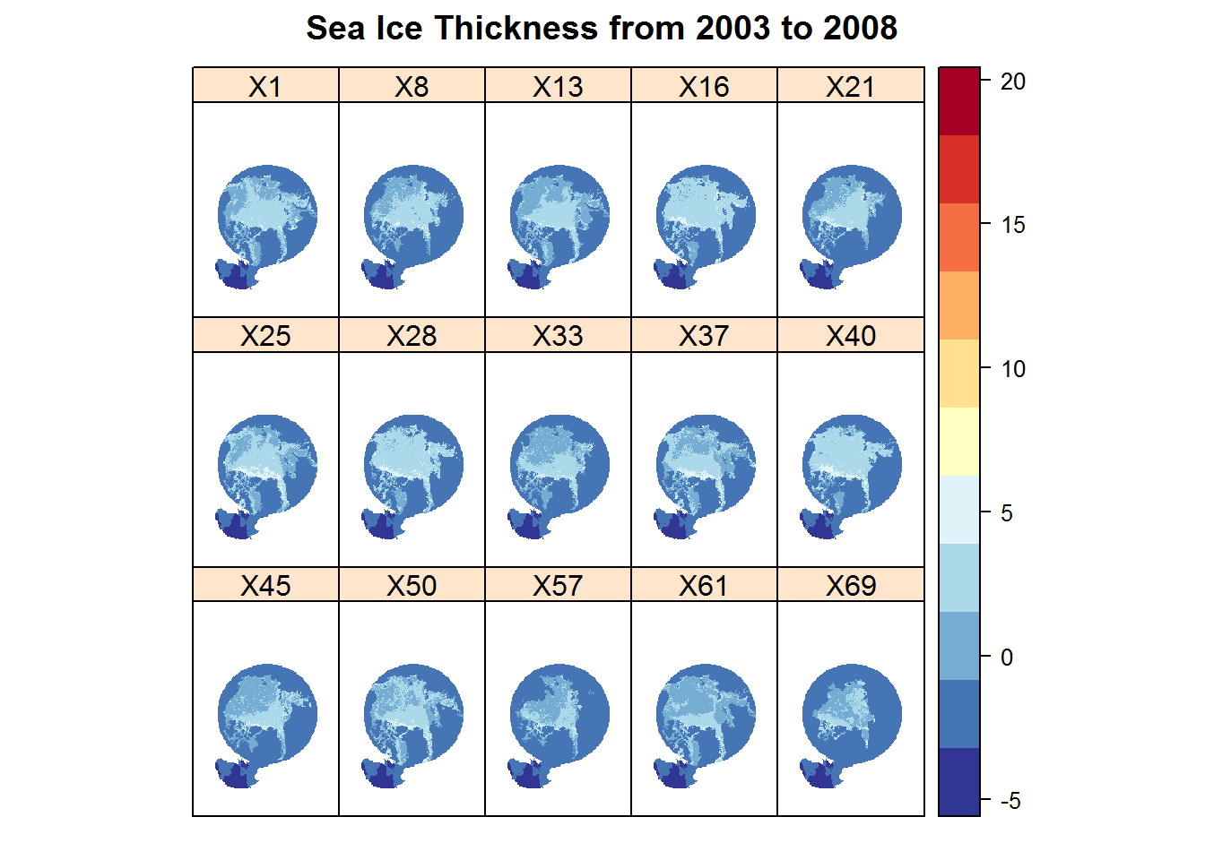
firstThickness <- st_mask[[1]]
lastThickness <- st_mask[[15]]

names(firstThickness) <- "First Month"
names(lastThickness) <- "Last Month"

spplot(stack(firstThickness, lastThickness),
       col.regions = rev(brewer.pal(11, "RdYlBu")), cuts = 10,
       main = "Sea Ice Thickness in the First Month and Last Month")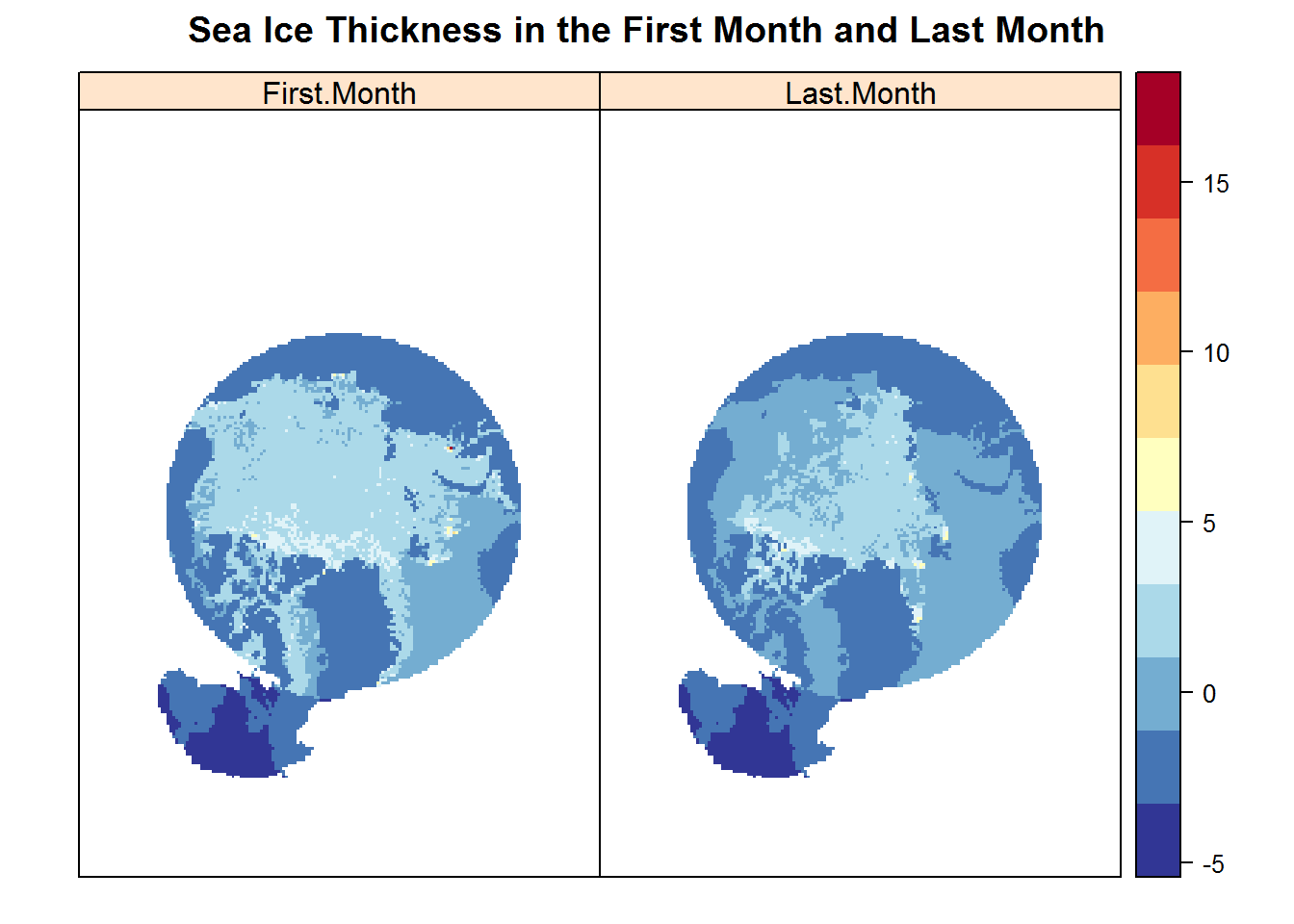
The sea ice thickness of the Arctic in the first month of 2003 is compared to the thickness of the last month in 2008. The darker the blue in the plot, the thinner the sea ice. The last month image shows clear changes in sea ice density, as indicated by darker blue areas in the northern portion, areas in the southern portion, and some in the eastern portion. This observation coincides with my hypothesis that I will see a decline in sea ice thickness overall from the first month to the last.
diff <- lastThickness - firstThickness
names(diff) <- "Thick Difference"
The linear regression displays the average thickness of the Arctic sea ice over the course of 69 months. The visual displays the month against the average ice thickness. The trend shows a clear negative trend over the course of the 69 months. The blue dots show variation in the short term but overall the trend is negative, indicating that sea ice in the Artic in the long term is declining. The shaded region shows the confidence interval for the regression. This coincides with my hypothesis directly.
# Calculate the average thickness for each month
avgThickness <- trend %>%
  group_by(Month) %>%
  summarize(avgThickness = mean(Thickness))

# Create a scatterplot between the average thickness and month, and add a fitting line to show the general trend of average thickness
# (the shaded area represents the confidence interval of the linear regression).
ggplot(avgThickness, aes(Month, avgThickness)) +
  geom_point(colour = 'blue') +
  geom_smooth(method = 'lm', colour = 'red') +
  labs(x = "Month",
       y = "Average Thickness") +
  ggtitle("Average Thickness of Arctic Sea Ice from 2003 to 2008")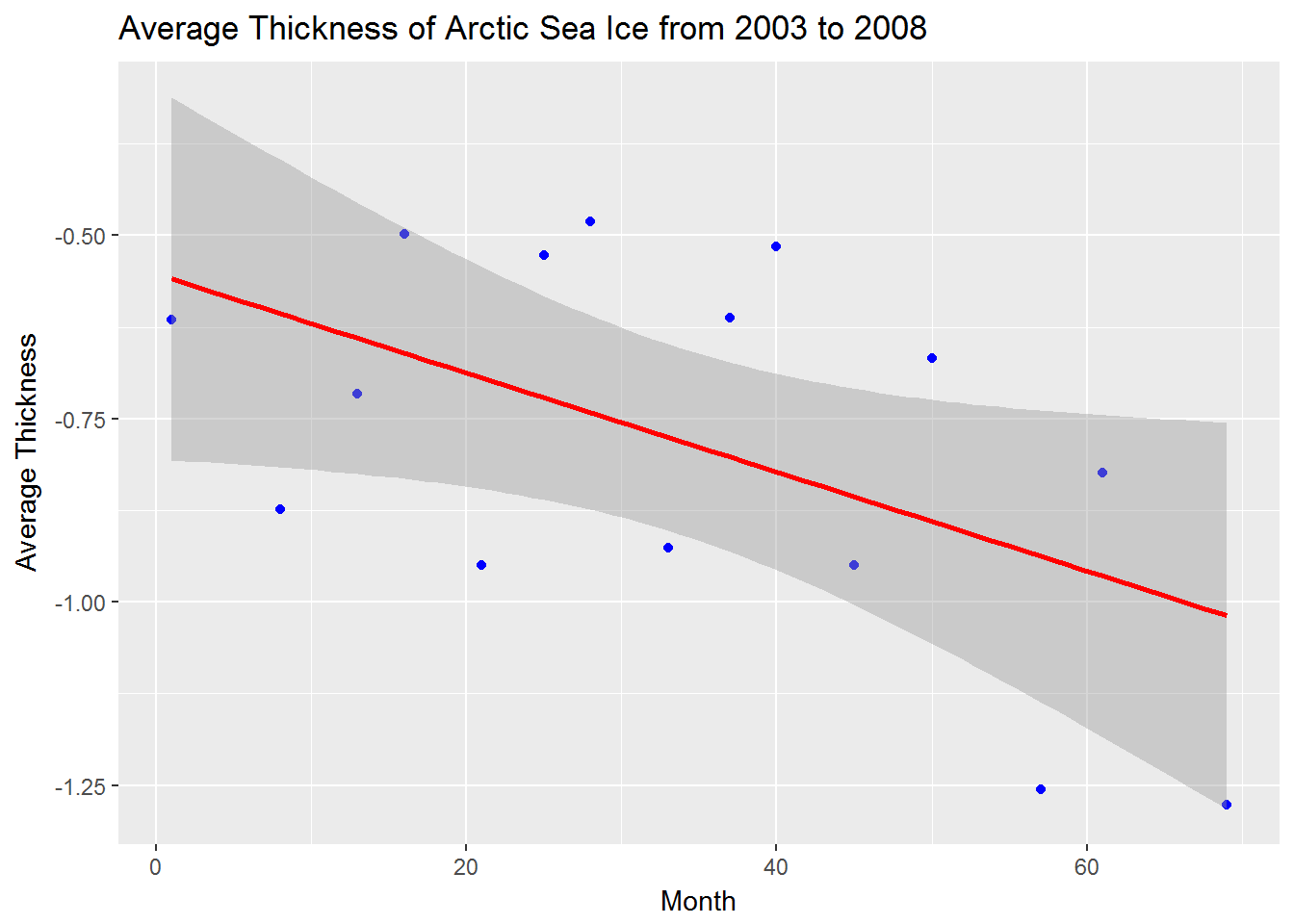
## Rasterization
# Convert the data frame to a spatial one.
pts <- trend
coordinates(pts) <- ~ x + y

# Define the projection system for the generated spatial point data frame.
proj4string(pts) <- projection(st_mask)

# Rasterize the spatial point data frame based on our raster stack file.
slope <- rasterize(pts, st_mask, field = "Slope", fun = mean, na.rm = TRUE)
names(slope) <- "Slope"
pValue <- rasterize(pts, st_mask, field = "pValue", fun = mean, na.rm = TRUE)
names(pValue) <- "p-Value"

# Display the results.
plot(diff, col = rev(brewer.pal(11, "RdYlBu")),
       main = "Ice Thickness Difference from 2003 to 2008")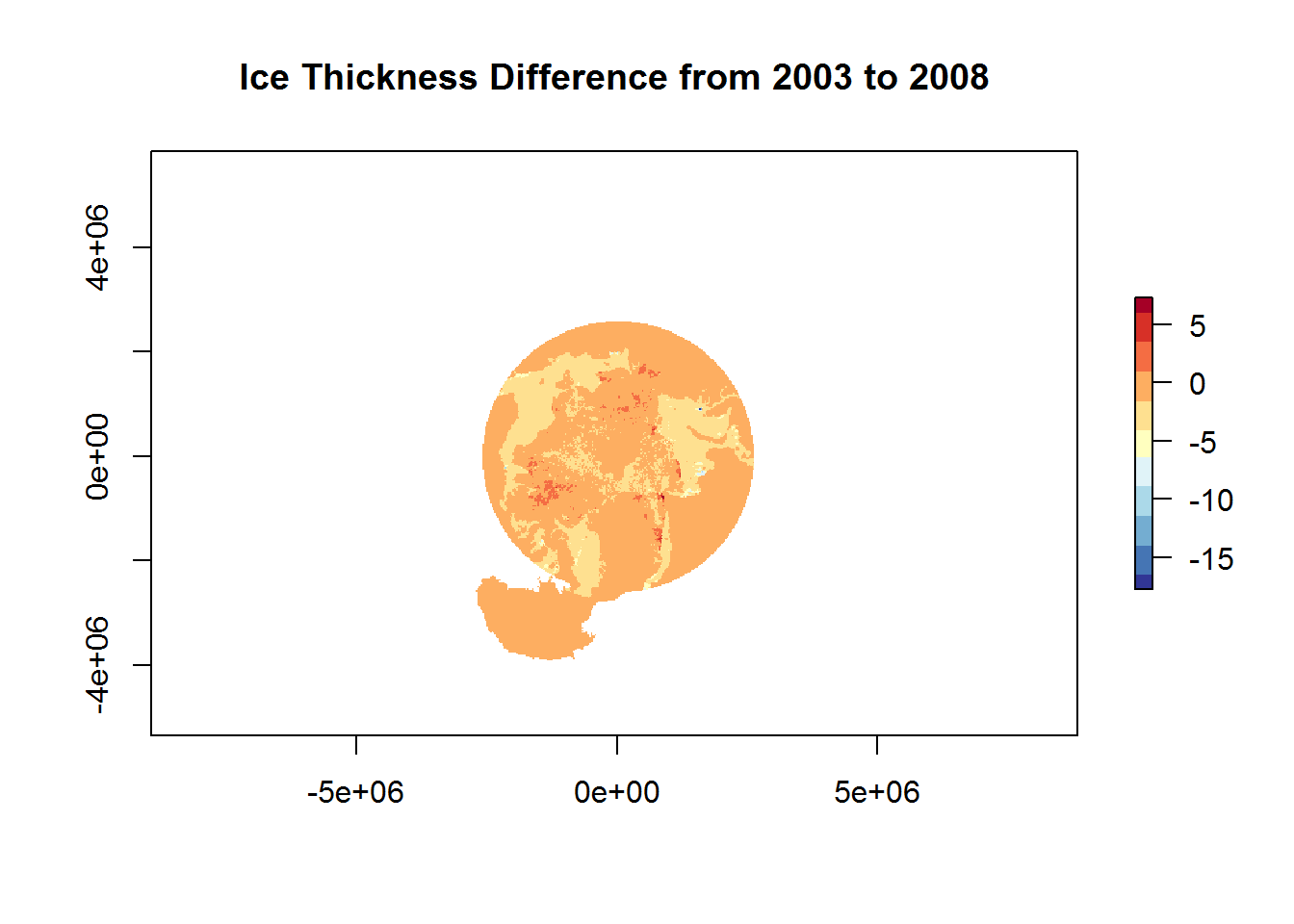
The ice thickess difference is displayed from 2003 to 2008. Areas of greater difference are displayed in darker orange. There are large areas of change in the nothern and eastern portions as well as some darker orange in parts of the southern region. This visual indicates the areas of greatest change and coincides with my hypothesis that there would be significant change from 2003 to 2008.
spplot(pValue,
       col.regions = rev(brewer.pal(11, "RdYlBu")), cuts = 10,
       main = "P-Value of Linear Regression Analysis")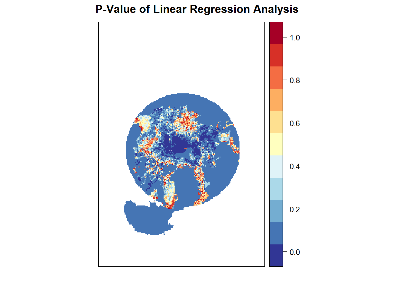
The P value visual analysis for the linear regression indicates where the most confident areas reside in the study area in terms of the overall trend. The areas in darker blue show the greatest confidence and the areas in light blue and orange indicate less. I believe that due to this data set being only for such a short amount of time (6 years) on a grand scale, that less confidence overall is expected; Also that with more years monitored in the Arctic, my low p value area could be much larger. I do believe for the data size, this is a good starting point for accurate data.
Conclusions
Overall, my hypothesis proved correct as the long term trend is negative and shows a decline in Arctic sea ice. The short term trends, over the 69 months, shows great variation overall but shows more variation towards the later half of the study (towards 2008). The short term trend, as proven, does not have to be negative month to month in order for the long term (6 year) trend to be negative. In a changing world where temperature rise is a growing concern, people often look at climate day to day, week to week, month to month expecting rising temperatures as an indication of climate change. In reality, short term variation often turns into long term negative trends if you look at the bigger picture. This is something I believe to be very crucial when studying and preventing climate change in the future.
References
National Snow and Ice Data Center (for data collection and downloading)
(for sea ice research)
Stammherjohn, S. E., et al. “Trends in Antarctic annual sea ice retreat and advance and theirrelation to El Nin˜ o–Southern Oscillation and Southern Annular Modevariability.” JOURNAL OF GEOPHYSICAL RESEARCH, vol. 113, 14 Mar. 2008, onlinelibrary.wiley.com/doi/10.1029/2007JC004269/epdf.
(for sea ice research)
Cosimo, J. C., et al. “Accelerated decline in the Arctic sea ice cover.” Geophysical Research Letters, 3 Jan. 2008, onlinelibrary.wiley.com/doi/10.1029/2007GL031972/full.
=